Essential digital experience metrics for development teams
Posted Mar 27, 2023 | 13 min. (2752 words)For the team that’s down in the trenches untangling legacy code, writing unit tests, and just trying to come up with sensible variable names, it’s easy to lose sight of the other end of the process, where code meets customer. You test, you deploy, nothing breaks, and you move on. However, it’s just as important to keep an eye on code quality in production, and how it’s experienced.
Experience, though, is hard to quantify. What do you measure? How do you measure it? How do you improve it? And why do you care? We lay out answers in this post. Here are 5 of the best digital experience metrics to help developers understand their code quality from the customer’s perspective.
This post is an excerpt from the complete guide to Digital Experience Monitoring metrics. Grab the full guide here.
1. Deployment frequency
What it means: This is a popular DevOps metric, but it also plays a complex role in your standard of digital experience. Higher deployment frequency tends to reflect a high-velocity, customer-oriented development culture. This also gives you the ability to rapidly and constantly detect and fix flaws and bugs as they’re introduced, upholding high customer experience standards as a matter of course. While longer release cycles allow teams to share large, noteworthy updates that can make an impression on customers, shorter release cycles enable teams to move rapidly and react to change, and respond to the customer. The faster feedback cycle that comes with constant deployment means you can ship solutions rapidly, get ideas to market ahead of competitors, and respond fluidly to changes in market conditions or user needs.
How to measure it: At the risk of stating the obvious, you need to keep records of how often your team ships code. This could be a good opportunity to create a public-facing changelog, with brief explanatory notes on what each deployment contains and is intended to achieve. You can also choose from a few handy repos on GitHub to capture core DevOps metrics, including deployment frequency.
How to improve it: To accelerate deployment frequency, you need lean and efficient processes. Luckily, the growing popularity of DevOps has yielded thorough best practice guidelines on CI/CD (Continuous Integration/Continuous Delivery) methods. To sustainably ship code at a rapid rate, development, testing, and operations teams need to work together to create a cohesive release process. Incorporating smart automation wherever possible also helps achieve speed — high-velocity teams often automate build management, deployment, and post-deployment tracking and alerting. Incorporating automated code reviews and testing throughout the CI/CD pipeline can also reduce delivery times by catching issues earlier, so you can nip them in the bud. It’s also helpful to have an error monitoring tool in place, so that you can deploy confidently knowing that if any issues are introduced, you’ll know about it before your customers are affected.
2. Apdex
What it means: Apdex (Application Performance Index), like Core Web Vitals, is a score that aims to center the user experience and get different teams on the same page. Apdex categorizes back-end response time data according to the type of experience produced, measuring the portion of users who are satisfied, tolerating, or frustrated. This turns impersonal numerical data, which can be difficult to interpret, into human-friendly insights about real user satisfaction, which helps disparate (and often non-technical) teams align on new features or improvements that could improve scores.
How to measure it: You define a unique target response time of one second or less, depending on the nature of your software. Users who fall within your target response time are “satisfied”. To calculate your “tolerating” response time, multiply the target response time by 4: if your target “satisfied” time is 1 second, your “tolerating” point is 4 seconds. And a user experiencing anything above 4 seconds is in the “frustrated” category.
To get your overall Apdex score, you take the total of “satisfied” response times, add that to half the tolerable response times, and divide by the total number of samples. You’ll always get a number between 0 and 1.

This is simple enough, but requires a bit of effort to measure and track on a rolling basis. There are a range of monitoring tools that will automatically measure and report your Apdex score for you.
How to improve it: To improve Apdex, you need to establish a cause-and-effect relationship between your scores and other activities. For example, you might use Apdex scores as a metric for success with each deployment to detect if shipping a new feature improves or lowers them. You can also use Apdex scores in testing on staging servers to catch user experience issues before they go to production.
While there’s definitely value in the simplicity of calculating and communicating Apdex across the business, Apdex isn’t really a standalone metric. Used correctly, Apdex scores are a strong insight into platform-wide trends, but should be used as a part of a wider monitoring stack and applied to the right contexts, not across the board as a measurement of success. They’re also not particularly useful for identifying specific issues that cause a degraded user experience. Discovering that, say, the backend inadvertently blocks additional requests while processing new users would take a huge amount of troubleshooting and testing—and even dumb luck—if you rely on Apdex in isolation.
Ultimately, Apdex is all about improving response times, a central component of performance. To consistently improve Apdex scores, you need to make performance a habit. Integrate regular, focused work on performance issues into your processes, like devoting a weeklong sprint every quarter.
3. P99s: Performance outliers
What it means: To gauge the experience of a large cohort, you usually use an average or a median to find the “middle” data point. But when it comes to performance, your upper outliers are also part of the picture. It only makes sense to prioritize the actions that will have the biggest impact on the largest segment of customers, but it’s important to keep even your slowest sessions within reasonable parameters. Every value represents the real experience of a real person interacting with your product.
Averaging works well when your data set is clustered within a relatively small range. But when it comes to measuring digital experience, an average can actually work to conceal the reality of large portions of your customer base. Because experience signals like page load time tend to fall across a broad range, it’s easy for a few outliers to skew your average and lead you astray or for the outer values (which need the most attention) to be hidden.
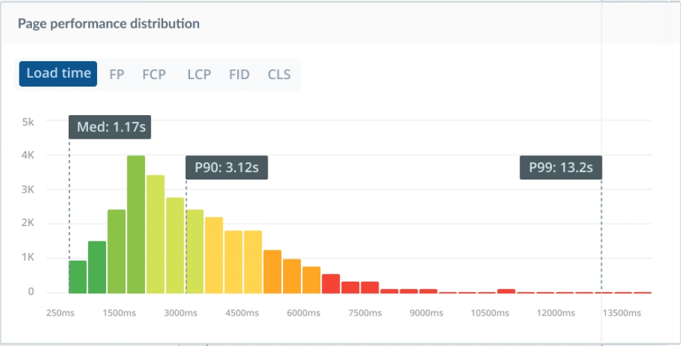
At Raygun, we use the median as a better indication of where the ‘typical’ customer actually sits because your median, by definition, will show where most of your customers are. And when it comes to controlling the acceptable upper limits, we choose to track the P99 – the time experienced by the 99th percentile of users. Expect this to be slow, but decide what your allowable definition of “slow” is; you still want to keep this closer to 5 seconds than 25 seconds. Tracking your P99 ensures that even the laggiest, buggiest, most frustrating experiences you deliver are still within reasonable parameters. Keeping your P99 in range acknowledges that we can’t guarantee perfection every time, but we can still keep ourselves honest.
It’s best to avoid tracking P100 as it’s the domain of total timeouts and bots that hold connections open, and it’s generally misleading about real users.
If you’re working on a large website with a lot of traffic, you’ll want to maintain P99 load times even during periods of significant fluctuation (say if you work in e-commerce and you need to ensure site stability over Black Friday weekend).
How to measure it: For this one, you’re going to need a monitoring solution in place. Sampling a subset of users or using a synthetic data set to approximate response times doesn’t really cut it here; the safest bet is a Real User Monitoring tool, which will capture full session data on the actual experiences of live users. Once you’ve set the upper limits of what your team terms an acceptable customer experience, your P99 shouldn’t exceed this. It will be a lot higher than your other targets, but you still want to keep this within a reasonable range.
How to improve it: To improve your P99, find the errors and performance inhibitors that are hurting your numbers the most and impacting the largest portion of users. As a general rule, take your 2-3 most hard-hitting errors and add these to your next sprint. Again, a monitoring solution that can order errors by user impact is the fastest and most accurate way to do this. However, just remember that your P99 is always going to look high, just by nature. Aim for progress, not perfection.
4. MTTR: Mean Time to Resolution
What it means: Sometimes also defined as “Mean Time to Repair/Recover”, this is the average duration from the beginning of an incident to the deployment of a fix. This metric is owned by the engineering team, and is one of the more “inward-facing” measures of digital experience. The higher your MTTR, the greater the impact on the organization, whether in cost, risk, or diminished trust from customers or partners. Most importantly for our purposes, the higher your MTTR, the longer bugs and issues are in the wild, and the greater the impact on your standard of experience.
How to measure it: In the simplest terms, MTTR requires hitting start on a timer when things go sideways, and calling time when you ship a solution. To track your average, you’ll need a process — ideally automated — to add this data to your records. You can automate the logging of incidents with a ticketing tool like Jira, which should integrate with your monitoring solution. Your alerting system can also double as initial timestamps. Our best advice is to avoid manual processes, because when an outage is in progress, you want your team’s skills and attention focused on resolving the incident, not worrying about whether they properly updated a spreadsheet.
How to improve it: Find out where slowdowns are occurring: are the right people being instantly alerted by your systems as soon as an issue or crash occurs? Does your tech team have the data to replicate and diagnose issues quickly? Does your support team have enough technical insight to effectively triage and assign tickets? Are diagnostic processes clear and frictionless? When a fix is created, do reviews and deployments happen without any unnecessary delays? Keep detailed records and pull data from your tools to see where things are being held up.
If you’re serious about resolving incidents as effectively as possible, you need the tools to monitor your customer’s experience and diagnose the root cause of issues. If you’re not already, use a monitoring tool like Raygun to trigger alerts based on specific conditions, custom thresholds, and filters, and automatically assign specific team members. You can use tagging to group errors that fit certain key criteria. For example, an online retailer might group all known shopping cart errors under the same tag, and create an alert that automatically notifies the relevant frontend team about the issue. When an error is immediately and automatically shared with the right team and flagged as urgent, MTTR drops.
It’s a good idea to use MTTR in combination with other metrics to get a fuller understanding of reliability. You may also want to track a metric like Mean Time Between Failures (MTBF) to understand how often incidents occur.
Development, DevOps, and Site Reliability Engineering teams can collectively reduce MTTR by creating a single “source of truth” for how shared systems and platforms should operate which documentation methods like runbooks, collaborative documents on the established process of remedying a known issue. When teams understand what led to a particular incident, they can learn from what happened to help deal with future errors and outages. You can also start performing a blameless postmortem for every significant incident. This results in clearer discussion and documentation of the incident, why it happened, and the steps used to resolve it. Done right, blameless postmortems encourage a culture of continuous improvement, and the more you can use an incident as a learning opportunity, the better your chances of reducing MTTR.
For more on MTTR, check out Site Reliability Engineering, a Google-developed operational playbook for improving DevOps, which includes processes like practical alerting, effective troubleshooting, and valuable postmortems.
5. Core Web Vitals
What it means: Google’s holy trinity of customer-oriented digital experience. These scores of a site’s speed (Largest Contentful Paint), stability (Cumulative Layout Shift), and responsiveness (First Input Delay) are designed to measure the quality of your website through the eyes of the customer. All three metrics combine to give you an overall pass or fail, which then factors into your search rankings. Maybe even more importantly, Core Web Vitals are also proven to have a significant impact on critical metrics like page abandonment and conversion rates.

If your site is fast, stable, and responsive enough to give 75% of your customers a “Good” experience, you get a passing score on your Core Web Vitals. Anything below this fails the assessment, compromises search ranking, and loses out on potential revenue from website visitors. Yikes.
How to measure it: To get you started, Google provides a few free tools to help assess, diagnose and test your Core Web Vitals. Once you’ve established a baseline and you’re ready to take action, Google highly recommends installing a Real User Monitoring (RUM) tool to understand how these metrics impact your real users.
First off, just drop your URL into PageSpeed Insights to get your initial score and an overview of your three Core Web Vitals. You can view your scores for your entire site at origin-level, or key pages at URL-level. Then, use Real User Monitoring to keep track of and maintain your scores across your entire live user base, long-term.
How to improve it: Google’s PageSpeed Insights will also provide a list of “opportunities” you can use to improve your Core Web Vitals. Reviewing this in combination with Real User Monitoring will help you work out which pages and which scores you can focus on to get the best and fastest results. Test optimizations as you go to assess their effectiveness, and review in PageSpeed Insights every 28 days (Google’s data update cycle) to confirm that you’re getting real results from your efforts. To maintain Core Web Vitals scores and all their associated benefits over time, you need to make optimizing and upholding your scores an ongoing part of your development cadence.
Core Web Vitals are a big deal in web performance, and they benefit different teams in different ways, from increased user engagement to maintaining or improving your organic search ranking. Ready to get the benefits of Core Web Vitals, but not sure where to begin? Luckily, we’ve put together in-depth guides to Core Web Vitals for both tech leaders and development teams.
It’s also important to note that while Core Web Vitals is here to stay, it’s also an evolving program, and that Google will continue to adjust the three current metrics in the future. It’s a good idea to subscribe to Google’s developer blog to stay informed, but also note that a decent RUM tool will roll out changes as they’re announced to keep you ahead of the curve.
The takeaway
There are many ways to define and measure code quality, but these are some of the most relevant to your customers. Pick your metrics well to avoid getting distracted by the sheer volume of numbers that have less bearing on your customer experience. Some will make more sense for your particular development workflow, but try to track at least a few: over-relying on just a single number can lead you astray.
These metrics were selected to help you view your software in terms of the human beings who are interacting with it. The other part of the equation is capturing them effectively and accurately — monitoring tools will show you exactly how your code is experienced by your customer, speed up error resolution, and reveal the opportunities to make improvements that will have the greatest impact.
This post is an excerpt from our complete guide to Digital Experience Monitoring metrics. Grab the full guide here.
Related reading
What is digital experience monitoring?