Visualize performance trends over time with the latest graph for RUM
Posted Aug 18, 2020 | 3 min. (458 words)Monitoring trends in application performance helps you identify poor performance and visualize the impact of performance optimizations you’ve made.
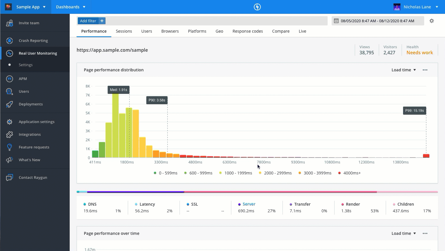
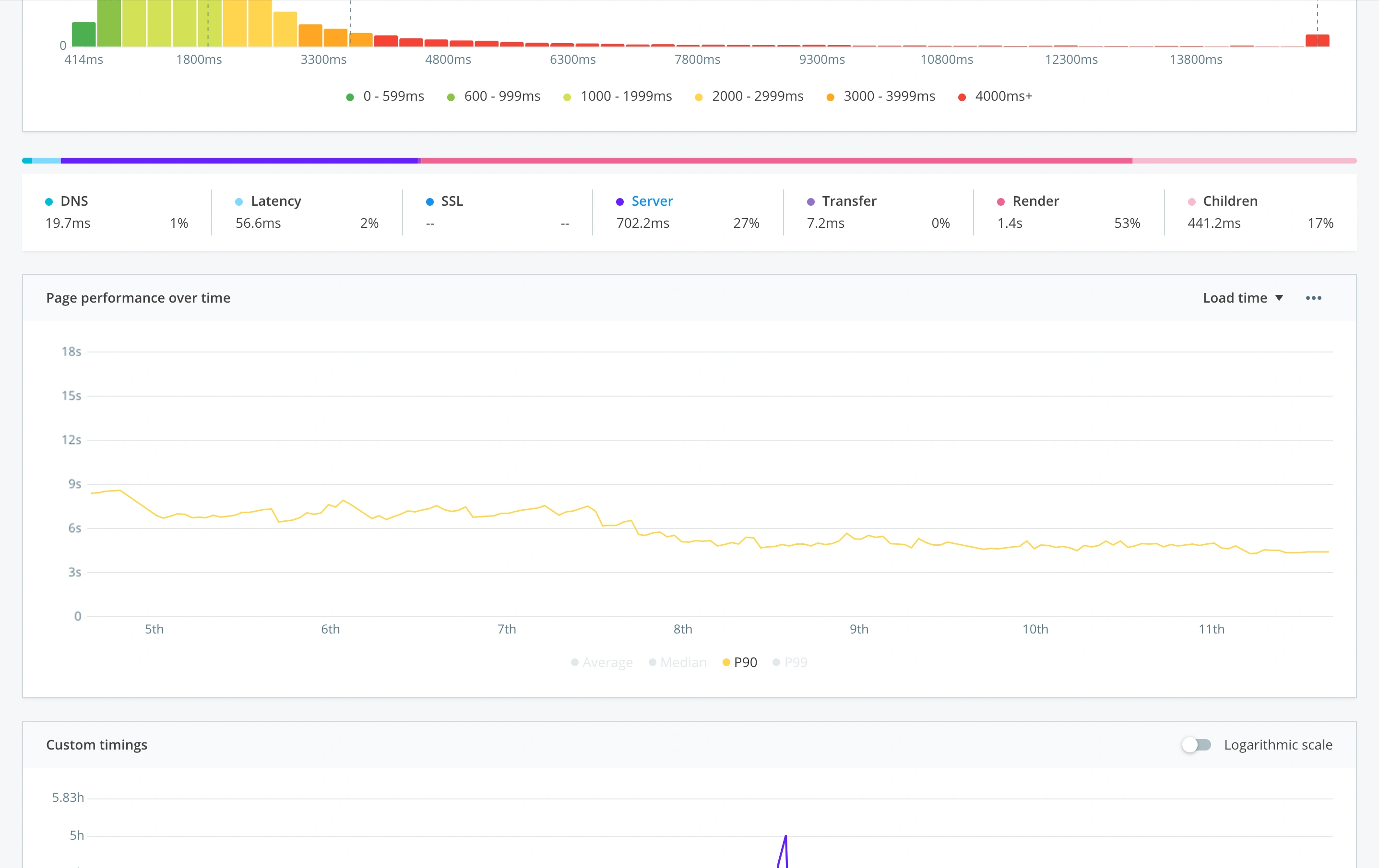
To help you better monitor performance trends, we’ve released a new line graph now available across all performance details pages in Real User Monitoring. This new graph visualizes the trend in performance for pages, virtual pages, XHRs, and mobile views, giving you even greater granularity into the performance of specific pages and areas of your application.
To see the new line graph, jump into the performance details page in RUM. Or, read on for more information about how this feature can support you delivering fast performing software.
Identify performance regressions
Observing trends helps you spot performance regressions that are causing a poor experience for your users.
Perhaps a recent deployment included additional critical render blocking code, or slowed down an XHR request, degrading the page performance.
With the line graph now available on the performance details page, you can easily spot regressions in performance by viewing the average, median, P90 and P99 page performance trends.
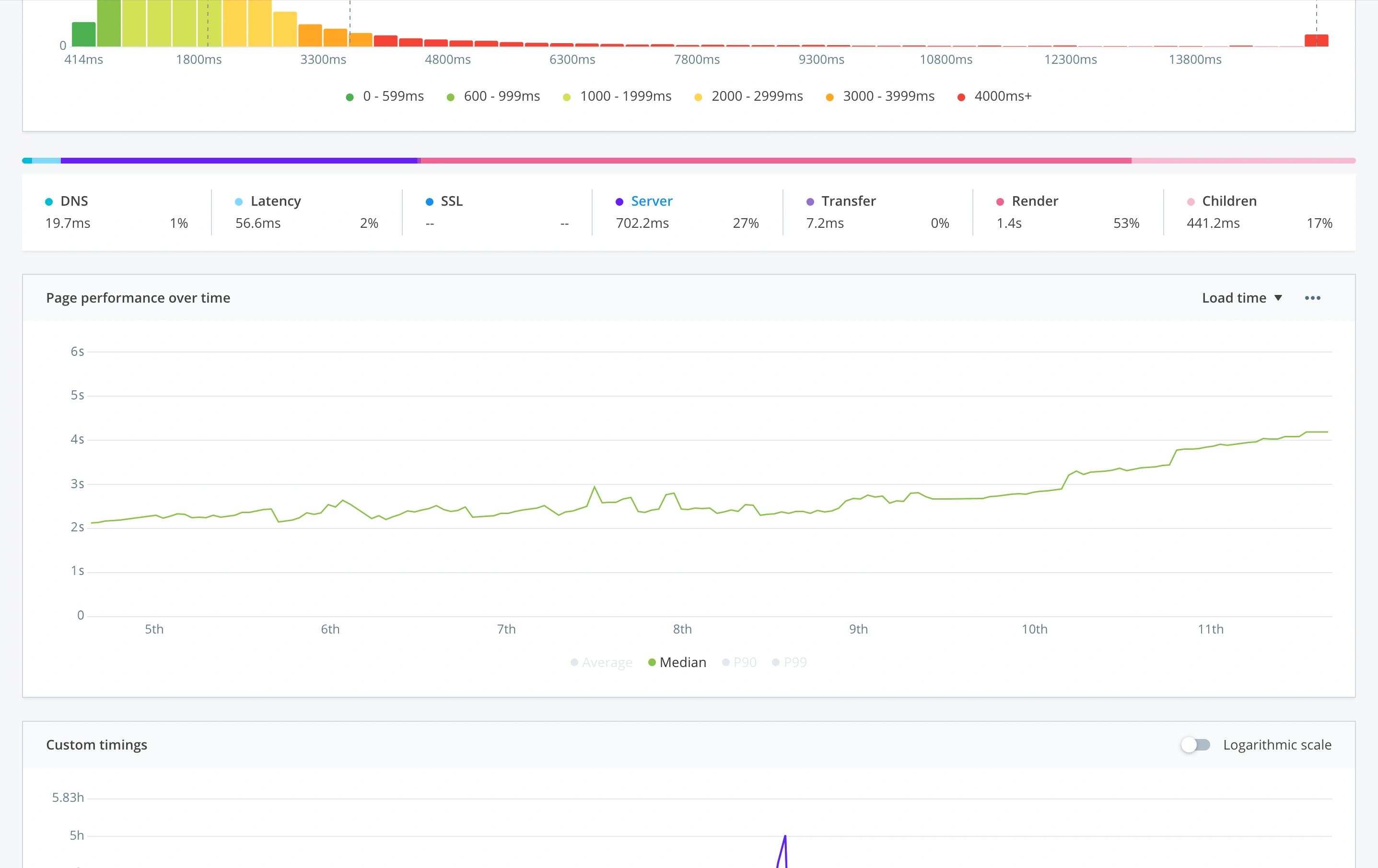 Easily spot performance regressions over time
Monitor performance trends at the resource level
RUM helps you and your team monitor your application to ensure you’re maintaining and improving fast performance as you iterate and update your product.
However, as we saw with some recent performance improvements we made to RUM certain page functions become redundant over time as parts of the application evolve and can add unnecessary overhead to load time. Seeing performance trends enables you to spot these regressions, investigate the cause, and make the necessary optimizations to improve performance.
See the impact of performance optimizations
Seeing trends at a granular level shows the impact of the optimizations you’ve made. With this latest release you can drill into those pages, virtual pages or XHR you’ve worked to improve the performance of, and see the trends before and after your changes.
With this you can easily demonstrate how your efforts have sped up a particular resource. Improving performance of your application and creating a better user experience.
 Demonstrate how performance has improved over time
See trends in XHR/AJAX performance
XHR/AJAX calls are a crucial factor in application performance, especially for single page applications that rely on XHR/AJAX calls to load virtual pages.
Those monitoring XHR/AJAX calls can now visualize trends in XHR/AJAX performance. The new graph can help you spot regressions in performance or see the impact that your optimization efforts have had on the performance of a particular call. This all contributes to a faster loading application for your customers.
If you’re new to Raygun and want to see how the new page performance graph can help you measure trends in application performance, start a free 14-day trial of Raygun Real User Monitoring.