Announcing the latest dashboard enhancements
Posted Jan 29, 2019 | 2 min. (391 words)When we first released our custom dashboard over a year ago, we had the needs of our customers in mind. The customizable tiles go a long way in ensuring that the dashboard meets your data display needs while being easy to use. We’re always improving the Raygun dashboard—here’s the latest from the app team.
Easier navigation
In the latest update, we’ve made the customizable tiles easier to access. Prior to this release, the free text options were in one long list. Now, we’ve separated them out into four handy tiles: Text, List, Value, and Chart.
Free text and paragraph tiles now available
The text and paragraph tiles are two of the biggest feature requests from our customers.
Therefore, to give you more customization, we’ve also introduced the ability to add custom text to your dashboard. This means you can now add notes and headings to your tiles. Just head to your dashboard and select Edit dashboard which will reveal the editing options.
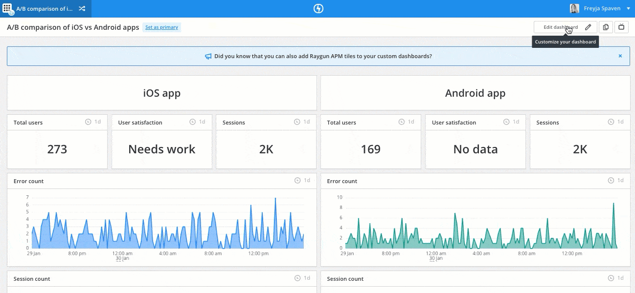
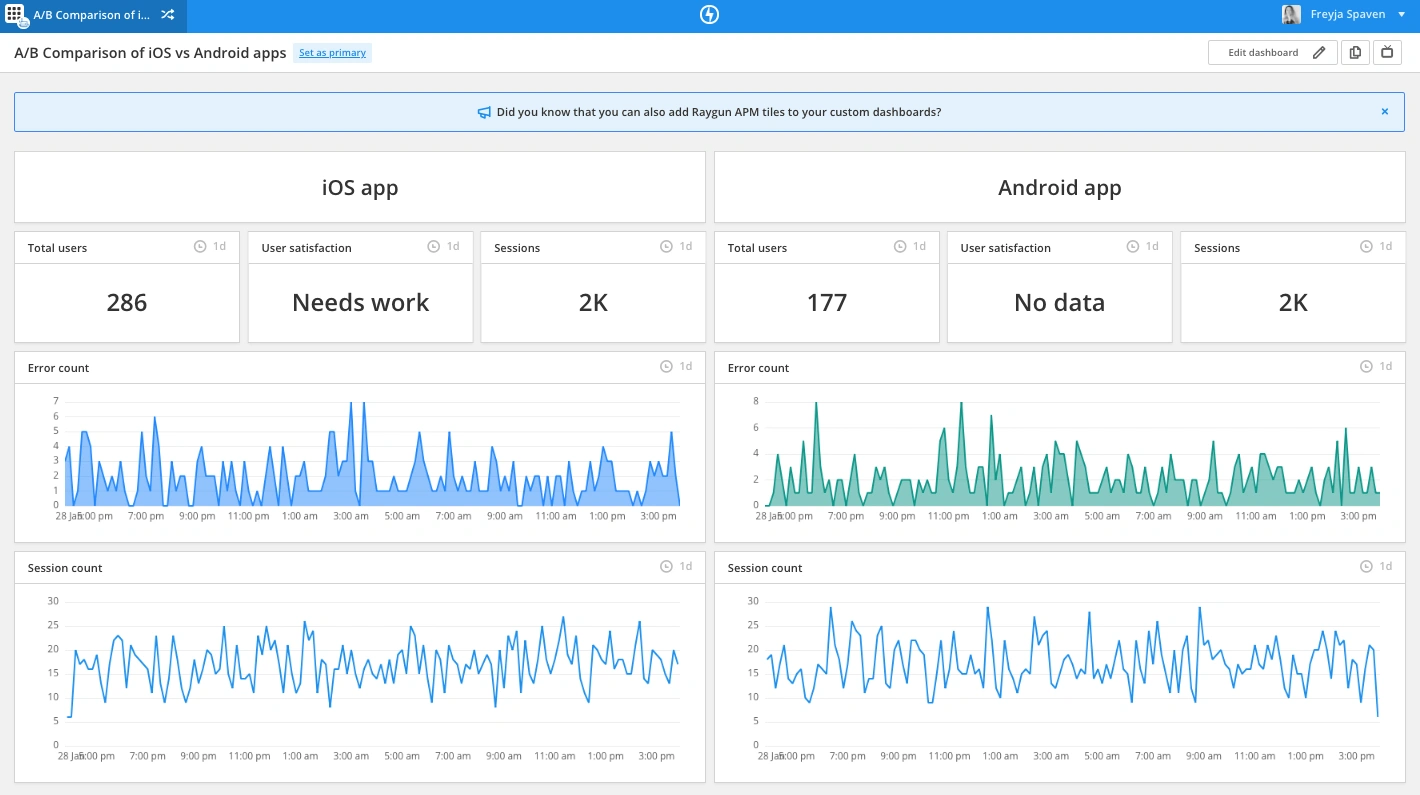
Free text tiles
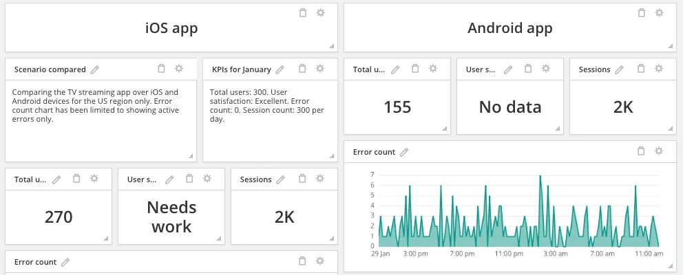
Text tiles are helpful when you need to compare metrics on the same dashboard so you can prioritize your time. For example, the following screenshot shows a dashboard comparing the performance of an iOS app against the Android app.
Paragraph tiles
The paragraph tiles allow you to add free text to a tile, which is useful if you would like to annotate your dashboard. For example, you might like to add details about the scenario you are comparing, or if you’d like to add your KPIs to keep them front of mind.
Future improvements for dashboards
We have a host of improvements on the way for the dashboard, including:
- The ability to drag-and-drop tiles
- Filters added to all tiles so you can quickly find tags and applications
- A timeboard added which allows time filters to be applied to all tiles
Watch this space for updates!
Extra tips for using the dashboard
Besides creating custom text, you can change the date ranges, and build multiple dashboards. For some inspiration on dashboards that you might like to create on your team, here’s how to build dashboards that track app usage, show how errors are currently affecting users, and view overall app speed.
Do you have ideas on how we can improve our dashboard tiles? We’d love to hear from you. Get in touch using our feature request forum.