Raygun’s Dashboards: Spot performance problems and get data quickly
Posted Apr 24, 2021 | 7 min. (1448 words)Raygun crash, error and performance monitoring brings you a new way to view and sort your data with Custom Dashboards.
The dashboard feature, which you will find inside your Raygun account – is designed to give you a better understanding of your overall software health, from errors and crashes to performance problems affecting your end users. To do this, Raygun gathers a vast amount of data about how users are interacting with your application and whether it’s performing optimally. We then present that data in an easy-to-use and intuitive UI: dashboards.
What you asked for
After some incredible feedback from our customers, we realized that having the data you need is only part of the puzzle. You also need to be able to understand and action your data quickly, so outages and performance problems don’t affect end users and take up valuable developer time.
You also asked for your data to be in a more digestible format for making data-centric and strategic business decisions.
Previously known as the Global Dashboard, the latest version goes above and beyond showing you what’s wrong:
You can now drag, drop, and edit your Dashboard display so your data can be presented to your whole team in an attractive UI. (You can view the full setup instructions in the documentation here.)
We built the Dashboard with our diverse customer base in mind, and displaying the data in a highly customizable and easy-to-use format is our first priority.
For this reason, the Dashboard has the following core functions:
1. Tiles
Tiles are at the core of the Dashboard and represent the different data points available for Crash Reporting, Real User Monitoring and platform-level data. We will be releasing more tiles inspired by your feedback from Beta and V1. We’d love to hear from you – head to our feature request forum to suggest more. Drag and drop individual tiles to display only the metrics you need to see. You can also customize the data inside the tiles to show specific time ranges or error groups:
A ‘Tile templates’ feature will be on its way soon to help arrange tiles to show specific data, but in the meantime head to the end of this blog post (ANCHOR) for some inspiration on arranging your tiles. Filtering options will also be available soon, allowing you to create filters around whether you have marked an error ‘Active’, ‘Resolved’ or ‘Permanently Ignored’ in your main dashboard.
2. TV mode
Presenting your data on a screen for everyone to see is a great way to rally your development team around a certain KPI. Want to resolve more errors for your end users than last month? Keep your most important data points front of mind by presenting your data in an attractive UI. (Watch this space for a TV DarkMode.)
The TV mode also works for mobile too. Pin the header, so when you have more tiles you can have an unobstructed view of the Dashboard.
3. Multiple Dashboards
The number of Dashboards you can create will depend on your plan type. With the multiple Dashboards, create and save your prefered Dashboard view for easy scrolling. For example, your backend development team may want to see a live crash data, while your management team wants higher level metrics such as amount of new users and location information.
Hone in on important data points so you can make strategic business decisions about resource allocation, watch an important deployment or simply display overall application health to your team so they can see immediately if there is something wrong.
Because there are many options and tile arrangements available, you may want to take some of the following tile configurations as inspiration when setting up your Dashboards:
- Display data for a non technical person
- See a high level overview of errors and crashes affecting your users
- See a high level overview of the performance issues affecting your users
For further details on the editable tiles and how they work, head to the documentation.
**1. Show a non technical person the traffic of your application **
If a non technical manager is asking how your application is doing, why not arrange tiles to show them with great UI rather than a spreadsheet filled with numbers? A graph that goes up and to the right is much more powerful. You could use tiles in this arrangement for example:

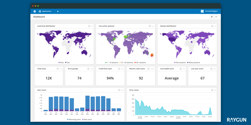
Tiles shown are:
- **Total user count **See the total number of returning and new users broken down by date
- Session count The total number of sessions of your application over time
- **New, Returning and Total users **Impress your investors by showing adoption rates, loyal users and total users of your applications over a given time frame.
- **Live active sessions **Shows the geographical density of where your app is being used right this second
- Live user count How many users are in your application right now? Get a high level view to understand more about your users
- **Live session count **How many sessions are currently running in your application? This information is updated live – watch out for traffic spikes at certain times of day for example

2. Get a high level view on errors and crashes users are experiencing
Do you have a team KPI to reduce the amount of errors in your application, or maybe to reduce any technical debt? This tile arrangement could work for you. Below, you can see a high level view of the errors in your application, their location and how they are affecting end users:

Tiles shown are:
- **Application error stats **A high level view of where the exceptions are mostly occurring and how many there are
- Error count A visualization over time so you can see trends in your error counts. This could allow you to spot a point in time where something changed, and address accordingly
- **Crash free users, Recent crash count, Error instances, and Error groups **These four tiles collectively give a timely overview of the count of crashes happening, and the percentage of users that have been affected. ‘Error instances’ shows a sum of how many crashes have happened over time. The ‘Recent crash count’ collects the crashes that have occurred in the last 10 minutes
- ** Top exceptions ** A list of which errors are occurring. Clicking into the errors will give you the drill-down on the information of that particular error group. They are ranked according to which errors are occurring the most over the current time range
3. Are you providing the best possible user experience?
At the end of the day, performance issues affecting end users affect your company’s bottom line. Get everyone on your team on the same page about where performance issues lie and where you are a cut above your competition. Set team benchmarks for performance improvements – and celebrate all the hard work your team puts in every day. For this aim, you might like to use a combination like the below:

**Tiles shown are: **
- **Load time distribution **This geographical tile allows you to specify a time range and displays the average loading time experienced in each country. If a majority of your customers are in a specific region, and you see if they are experiencing slow load times, it might be something to give attention to.

- **New and returning users **How are your users behaving? Are they signing up and staying? This is an excellent use for the new and returning users tiles.
- **Crash free users, Recent crash count, Error instances, Error Groups **Assess how many users are experiencing no crashes at all? Aim to improve this number over time. How many crashes did your application just experience? Assess whether they were major or minor, then address them quickly and easily by going into your Crash Reporting dashboard.
- **Average load times **If you have a high load time, it might be time to reassess slow loading pages.
- **Session distribution Which country is your app most popular in? Get a high level overview of the global distribution of your customers by session. **
- **Live health score Want **to show off that you are giving your customers the best quality software experiences? The live health score will calculate overall health performance in real time, giving an accurate high level view of the health of your application.

Getting started is easy
Raygun’s Dashboard will give you a crystal clear overview of the health of your application. By dragging and dropping the Dashboard tiles into your preferred arrangement, you can create a rich and dynamic picture of your overall software health.
Start exploring the Dashboard tiles today, and watch this space for more tiles on their way soon!