A quick look at ECharts – Javascript charting
Posted Aug 4, 2015 | 5 min. (1040 words)I’ve been playing around with various Javascript charting libraries recently, and ECharts is one of my favourites. Overall I’ve found it very easy to use, and has a good balance between simplicity and flexibility. I personally think that ECharts is well documented, and has lots of good samples to work from. As it is Canvas based, and can’t be styled with css, its visual customizability is a little bit limited, though everything I’ve wanted to do has been possible. If you do find it meets 95% of your needs, you could always fork the source code.
While playing around with this, I’ve just been using the eCharts Javascript file in my project and referencing echarts directly, and hence my code below is based on this. Feel free to use require.js as the official docs do. Regardless, here’s the steps I use to start working on a new chart:
Step 1 – A host element
The first thing you’ll need is a DOM element to host the chart. I’ve read that this can be just about any type of element you want. I use div, because it just makes sense. Two things you’ll need on your element – first, some way to identify it in Javascript such as an id or a class name. Secondly, the element needs to have a width and height before rendering the chart, so make sure to set the size in some way such as in the Javascript, with css, or in my example below, with inline styles. (Hopefully our design team doesn’t read this blog).
<div id="chart"></div>Step 2 – The chart options
This step is where most of the work will be done. You need to create an object that will define what you want the chart to look like. Below is a reasonably minimal set up just to aid in getting started. Before going into any detail, lets move on to the final step so that you’ve got a chart to display and work with.
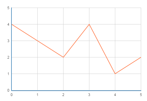
var chartOptions = {
  xAxis: [{
    type: 'value'
  }],
  yAxis: [{
    type: 'value'
  }],
  series: [{
    type: "line",
    data: [[0, 4], [1, 3], [2, 2], [3, 4], [4, 1], [5, 2]],
  }],
};
Step 3 – Initialize and apply options
Last of all, you need to initialize the chart object with the host element, and then apply the chart options. I’ve been using Backbone and Marionette while playing around with charting libraries, so here’s what my code looks like (Where chartHost is an ItemView ui selector ‘#chart’).
var chart = echarts.init(this.ui.chartHost[0]);
chart.setOption(chartOptions);
If you’re not using Backbone, there are of course other ways to get the host element, such as this simple example:
var chart = echarts.init(document.getElementById('chart'));
chart.setOption(chartOptions);
And here’s what the minimal chart looks like:
A bit about axes and series
As seen in the simple chart options example above, the fundamental components of building a chart are the axes (X and Y) and series. All of these are arrays, as you can have however many you need, and they all have a ‘type’ property which will affect their behavior, display and what further properties you can use.
The valid axis types are:
- value – which I’ve used in the above example – a simple axis for plotting numeric values.
- category – probably the most commonly used axis type – this requires you to set the ‘data’ property of the axis which is an array of objects. These objects will be used as the context of the axis labels, and will be evenly spaced along the axis in the order you provided them.
- time – a date time scale – best used when you have irregularly spaced datetime data. If some points are separated by a week, but others separated by a day, you’ll probably want the spacing of the data in the chart to reflect this, in which case a time axis is what you’ll want. If your datetime data is already evenly spaced (e.g. a data point for each hour of a day), I find it easier just to use a category axis.
- log – logarithmic scale – used for specialized scenarios where you need to plot data along a log scale to improve readability.
As I think the category axis is very useful and commonly used, here is in example for you to get started with. Note that I’m now setting the data property of the xAxis, and the values in the series data are single values, rather than pairs of X/Y values. Another thing to note is that you’ll want the length of the axis and series data arrays to be equal.
var chartOptions = {
  xAxis: [{
    type: 'category',
    data: ['Klingon', 'Vulcan', 'Borg']
  }],
  yAxis: [{
    type: 'value'
  }],
  series: [{
    type: "line",
    data: [1, 4, 5],
  }],
};
ECharts provides a huge range of different chart types – whatever chart you need, you’ll probably find it here:
- line – Includes basic line charts, filled areas, splines and stacked data. All of these also support displaying symbols at each plot point.
- bar – Can be displayed vertically or horizontally, supports combinations of stacked and side-by-side arrangements, and can be used to create tornado or waterfall charts.
- scatter – Simple symbol plots, bubble charts (symbols with different size to display 3rd dimension of data) and supports massive amounts of points.
- pie – Also used to create Doughnut charts, Rose diagrams and some trippy spirals
- radar – Polar charts with lines, areas or wormholes
- map – Comes with geographical data that can display a world map or be broken down into country views. Animated pings and jump lines can create some nice effects. Also supports providing your own map data.
- And lots more – Also included are Candlestick, Chord, Force-directed diagram, Gauge, Funnel, Heatmap, Event-river, venn-diagram, Treemap, Tree diagram and Word cloud
Want to give it a go?
This has been a very short introduction to get you started with ECharts. If you want to try it out, the next step would be to start playing around with the available chart options. Here is the documentation regarding the chart options. The colored table displays the top level chart option properties you can work with. Click the links to see what customizations you can make.