Sass tutorial: A first look at writing more maintainable styles
Posted Jun 13, 2017 | 8 min. (1509 words)Learning how to use HTML, CSS and the basics of JavaScript can be fairly simple. Almost anyone can produce a small, functional website providing you know how to use Google and have some patience.
However, if you bump the scale of that website up about 10x, add in another developer and create multiple variants – each with their own unique functionality and styles – your code is going to become a hassle to maintain and new hires are going to have a nightmare trying to figure out your codebase.
Using a CSS preprocessor like Sass (Syntactically awesome style sheets) effectively will help modularize your CSS code making it more maintainable, understandable and reusable. Sass consists of two syntaxes, the original syntax called “the indented syntax” and the newer “SCSS”. The examples I give in this post use the SCSS syntax as this is my personal preference, but you can use either. In this Sass tutorial, we’ll walk through the setup process and what you need to know for writing more maintainable and reusable code.
Setting up Sass in your new project
Firstly, before we dive into writing any Sass, make sure you have checked out the Sass documentation on installation and the Sass basics section to get the Sass compiler working on your system.
Once you have Sass successfully set up for your project, we can now start setting up the file structure for our stylesheet partials and master files.
I like to create a sass/ directory to hold all our precompiled code and a css/ directory to hold all the output. For easier maintenance on large projects, I would recommend creating extra directories within the sass/ directory to hold different types of partials. As a basic example, I will create the following folder structure:
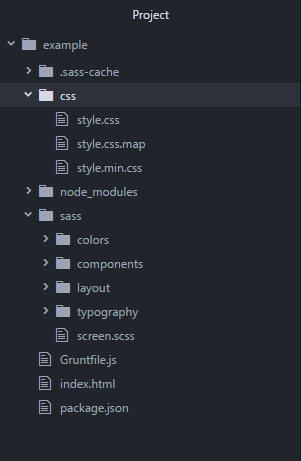
As you can see in my example colors, components, layout, and typography have been separated into their own directories. This enables us and anyone else digging around in our codebase to easily find files later on.
Sass variables and style modularization
Adding Sass to your project brings many advantages. One of the biggest is the ability to set and use variables. When it comes to writing maintainable styles the use of variables is a no-brainer. To create a variable we just need to add a $ before the variable name then just assign the variable a value.
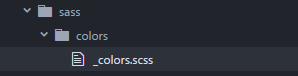
As an example, I’ll create a _colors.scss stylesheet partial within our sass/colors/ directory that will hold all our color values. Note that I prefixed the partial with an underscore. This lets Sass know that the file is only a partial file and that it should not be generated into a CSS file:
 // _colors.scss

$white: #FFFFFF;
$black: #000000;

$red: #C62828;
$blue: #3b88ad;
$green: #2E7D32;
$yellow: #F9A825;
$grey: #424242;
// ...
Now that we have the _colors partial we are going to need to import it to the master screen.scss file found in the sass/ directory. Sass offers the ability to reference other stylesheet partials using the @import keyword, so, using this, I’ll import the _colors.scss into screen.scss like so:
// screen.scss
// Colors
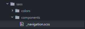
@import "colors/_colors.scss";Now any style partial added to screen.scss will have visibility of the color variables. I’ll go ahead and create a navigation partial inside of components/ , add it to screen.scss and use a color variable as one of the properties:
// screen.scss

// Colors
@import "colors/_colors.scss";

// Components
@import "components/_navigation.scss";
// _navigation.scss
.navigation {
position: fixed;
top: 0;
width: 100%;
height: 50px;
color: $white;
background: $grey;
box-shadow: 0 0 5px rgba($grey, 0.8);
text-align: center;
line-height: 50px;
ul {
display: inline-flex;
margin: 0;
li {
list-style: none;
padding: 0 50px;
height: 100%;
&:hover {
background: rgba($blue, 0.5);
}
}
}
}As you can see .navigation now has a background color of $grey and a text color of $white . This will match the value we assigned in the _colors.scss partial compiling to background: #424242; color: #FFFFFF; after running it through the Sass precompiler:

Now we have this all set up, say we wanted to change the color of $blue to a new color, all we need to change is the value in _colors.scss and recompile the Sass. The new value will be assigned to all $blue references:

Mixins and control directives
When it comes to writing maintainable styles it’s always a good idea to keep your code as DRY as possible. Utilizing Sass mixins is a great way to minimize the amount of code you write and helps make it easier for others to read.
Mixins are essentially blocks of code that let you group together style declarations that we can then reuse throughout our site. Mixins can be used in various ways. I would recommend checking out the docs for a more comprehensive look at these.
Another great feature of Sass is the ability to generate styles by using control directives. These include @if , @for , @each and @while . If you have used another programming language in the past you may already be familiar with these but they are basically a way to generate multiple styles based on a given expression.
Let’s create some font-size classes using the @each control directive…
Firstly we need to create a _font-sizes.scss partial and import it to screen.scss

// screen.scss

// Colors
@import "colors/_colors.scss";

// Font sizes
@import "typography/_font-sizes.scss";

// Components
@import "components/_navigation.scss";
Now specify all the font sizes we want to use, as a variable in _font-sizes.scss . We can then use this variable to create classes for each value using @each.
// _font-sizes.scss

$font-sizes: 8px 10px 12px 14px 18px 24px;

@each $font-size in $font-sizes {
  .font-size-#{$font-size} {
    font-size: $font-size;
  }
}
After the Sass has been run through the precompiler you will see that we now have a class for each value in your output file.
/* style.css */

.font-size-8px {
  font-size: 8px;
}

.font-size-10px {
  font-size: 10px;
}

.font-size-12px {
  font-size: 12px;
}

.font-size-14px {
  font-size: 14px;
}

.font-size-18px {
  font-size: 18px;
}

.font-size-24px {
  font-size: 24px;
}
Now that our font sizes are handled by the $font-sizes variable to add, delete or update a value we just need to edit the variable and Sass will update all the styles for us.
@each is great when you have a set of values you wish to create styles from. However when dealing with a range of values @for is better suited.
To demonstrate the @for control directive let’s create a simple grid layout. I have already created a _grid.Scss partial in the layout directory and included it in screen.scss. Now let’s add a $grid-columns variable, this will be equal to the number of columns you want the grid to have. Using @for in conjunction with $grid-columns will generate all the grid classes that we need.
// _grid.scss

$grid-columns: 12; // Will be a 12 column grid

.grid-column { // Default grid-column styles
  position: relative;
  float: left;
  width: 100%;
}

@mixin grid-classes($column) {
  $width: (100% / $grid-columns) * $column;

  .grid-column-#{$column} {
    width: $width;
  }

  .grid-column-offest-#{$column} {
    margin-left: $width;
  }
}

@for $column from 0 through $grid-columns {
  @include grid-classes($column);
}
As you can see from the example we have 12 grid columns, some default styles for .grid-column class, a mixin to create the grid-classes and the @for control directive. The @for loop will run from through to whatever you set your $grid-columns variable as calling the grid-classes() mixin each time with the $column number being passed into it.
Then the mixin will create the .grid-column-{number} and also .grid-column-offset-{number} classes for us. After running this code through the precompiler this is what it produced:
/* style.css */

.grid-column {
  position: relative;
  float: left;
  width: 100%;
}

.grid-column-0 {
  width: 0%;
}

.grid-column-offest-0 {
  margin-left: 0%;
}

.grid-column-1 {
  width: 8.33333%;
}

.grid-column-offest-1 {
  margin-left: 8.33333%;
}

.grid-column-2 {
  width: 16.66667%;
}

.grid-column-offest-2 {
  margin-left: 16.66667%;
}

.grid-column-3 {
  width: 25%;
}

.grid-column-offest-3 {
  margin-left: 25%;
}
/* ...... */
We can now use these classes in our markup and will work as expected:

As we have automated the generation of our custom grid, say we wanted to change from 12 columns to 24. We can easily just update the $grid-column value and recompile our SASS code and everything else is done for us!
Wrapping up this Sass tutorial
Writing maintainable styles can easily be accomplished by using Sass, however, this is not the only language out there to do this. Other languages like LESS and Stylus offer similar features and I would recommend checking them out to find the preprocessor that works for you. If you want to see a full list of all CSS preprocessors Slant’s page has a list of all options with reviews on each one.
Thanks for reading, and hope you enjoyed this Sass tutorial on writing more maintainable and reusable code.
(Source code is available on GitHub.)
Now read…
Six reasons you should use a CSS preprocessor
How can Raygun help you get more insights into problems in your code?